


Adding new filter option
Question: What is a filter option?
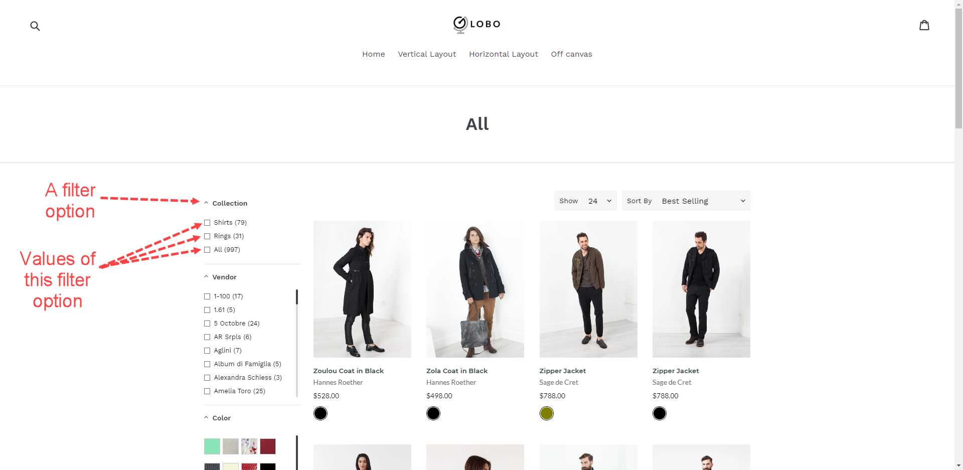
A filter option is a group of values that have the same product data type (color, size, product type, collection, etc.). Filter option values appear under the Filter option name.
Steps to manage
In the below steps, we will create a new filter option by Product Tags!
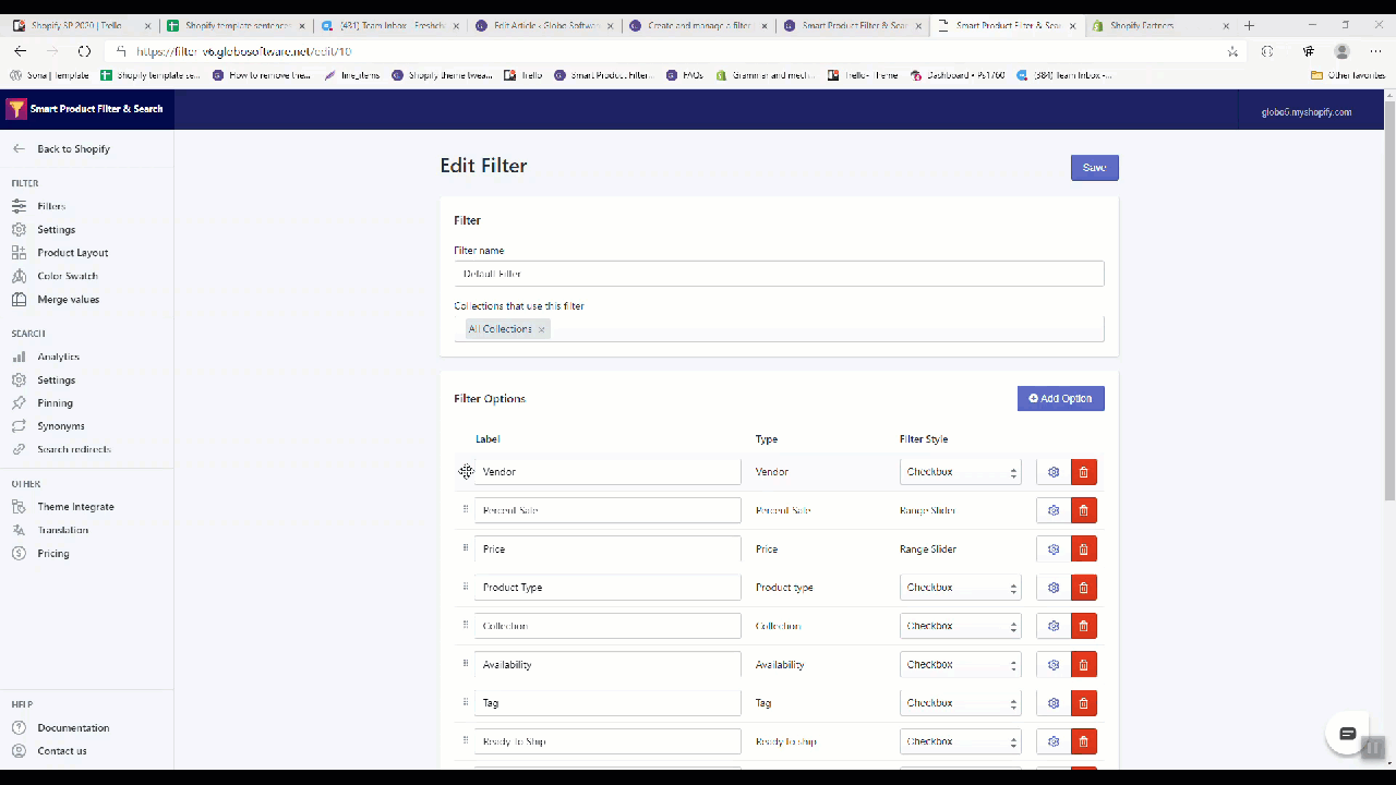
- From the app’s top navigation bar, click Manage Filter under the FILTER section.
- Click the edit filter icon.
- Scroll down to the Filter Options section.
- Click on the Add option button.
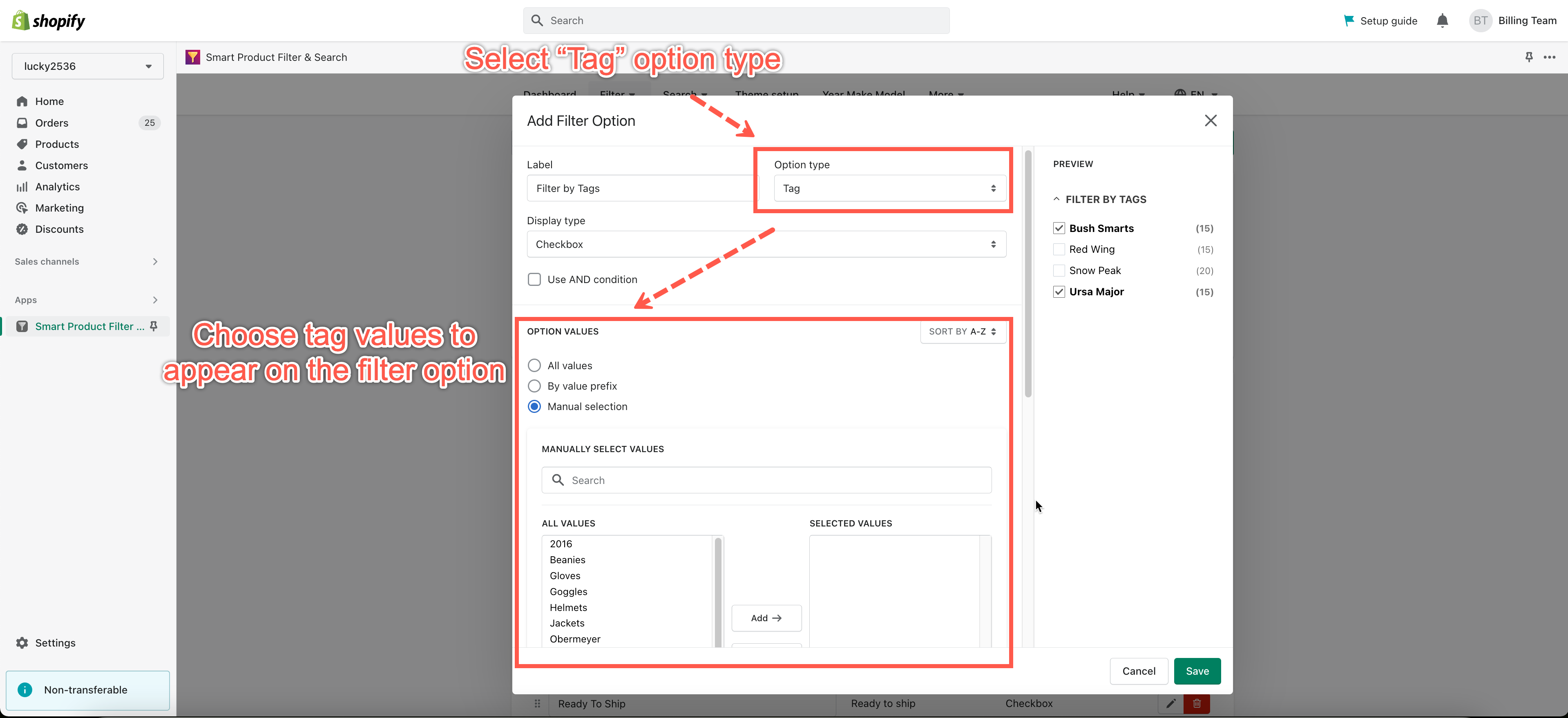
- In the Label field, enter the filter option name.
- In the Filter Type dropdown, select a data type of this new filter option. In this case, we choose the “Tag” data type.
- In the Display Style dropdown, select a filter style for this new filter option.
- Choose the list of product tags to appear on this filter option – see more HERE.
- Click the Save button to finish.
Changing filter option order
Steps to manage
- From the app’s left navigation bar, click Filter under the FILTER section.
- Click edit filter icon.
- Scroll down to the Filter Options section.
- Drag & drop a filter option to the expected position.
Editing filter option
Steps to manage
- From the app’s left navigation bar, click Filter under the FILTER section.
- Click the edit filter icon.
- Scroll down to the Filter Options section.
- In the Label column, you can adjust the filter option name.
- In the Filter Style column, you can select a style for this filter option: Checkbox, Radio, Swatch, and Swatch-text.
- Click the red trash icon to delete a filter option.
- Click the setting icon to manage the advanced filter option settings and filter option values. Those advanced settings include:
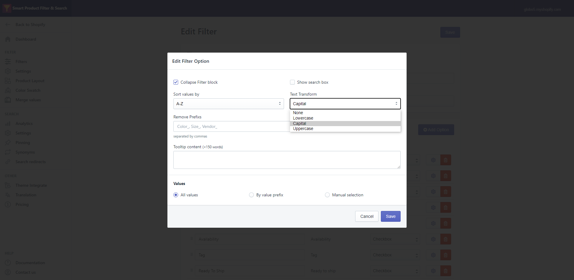
- Collapse filter block: Collapse all filter option values by default.
- Show search box: Show a search box under the filter option name.
- Sort values by: Define the order of the filter option values. You can sort values by A-Z / Z-A / Manually.
- Remove prefix from values: Remove unnecessary characters of filter option values. For example, you add ‘partners-‘ to the box below to remove ‘partners-‘ from the partners-demo text.
- Custom text transform: This feature helps to set the text format for the filter option values. We provide four formats: None / Lowercase / Uppercase / Capital. Let take ‘Sterling Ltd‘ filter option value as an example.
- None: No change to the filter option value text format.
- Lowercase: ‘Sterling Ltd‘ value will be transformed to ‘sterling ltd‘.
- Uppercase: ‘Sterling Ltd‘ value will be transformed to ‘Sterling Ltd‘.
- Capital: ‘Sterling Ltd‘ value will be transformed to ‘STERLING LTD‘.
- Tooltip content: This feature helps to give a brief explanation about the current filter option for your customers
- Values: Please see these guides to learn more.
- Sort values by A-Z / Z-A: https://globosoftware.net/kb/sort-filter-option-values-in-alphabetical-order/
- Sort values manually: https://globosoftware.net/kb/sort-filter-option-values-order-manually/
Filter option style
This app provides 5 filter option styles which include: Checkbox, Radio, Range slider, Swatch, and Swatch-text.
- Swatch and Swatch-text styles are only available for Product options and Tags.
- Range slider style is only available for the product price, percent sale, and Product options.
- Checkbox style: Customers can select multiple values of a filter option to start filtering.
- Radio style: Customers can select only a single value of a filter option to start filtering.
